How to Create an Infographic: Six Essential Steps

Infographics are a fun and easy way for your customers to digest information in today’s digital world and as such are an important type of content. But they must be done well. Discover how you can create an infographic with WORD EMPIRE'S six essential steps for a successful infographic.
What Is an Infographic?
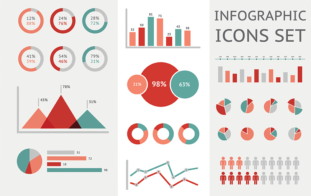
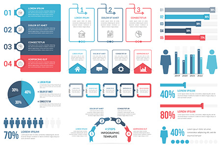
Before you even begin to create an infographic it’s important to understand what an infographic actually is. An infographic is a visual representation of information displayed in an easy- to understand and engaging format. Ultimately infographics simplify complex information for readers making it easier to read and understand.
Given that humans think in pictures and half of the human brain is visual, infographics have become a popular form of content for brands. As a B2B or B2C, you should be incorporating infographics into your content strategy if you haven’t already done so.
Tell a Story For Your Customers In an Infographic
Storytelling is the backbone of any infographic so your infographic must tell a story. It’s a non-negotiable! Without a story, you just have a graphic with no point. There's no purpose to it. A story brings an infographic to life.
Your story should be clear, succinct (remember it's not a novel) and in sequential order (beginning, middle, and end) so it makes sense to your readers. Tell a compelling narrative that keeps your readers engaged. Ask yourself the following when crafting your story:
- What is the story I want to tell?
- Why am I telling this story?
- Who am I telling this story to? (target audience)
- Where is this story coming from? (your brand, data, happenings, trends, etc)
- When is the best time to tell this story? (timing and content schedule)
Great Visual Style for Your Infographic
This should be a no- brainer given that an infographic is a visual representation of data. So, when you create an infographic it must have a strong visual presence. It’s got to be eye- catching.! However, it’s not just about adding some nice fancy graphics and images and you’re done. There’s a lot of strategy involved in infographics.
The first rule of thumb is that the visual style you choose makes the infographic readable and scannable. Your readers should be able to see most of the information at a glance. Most infographics read from left to right and top to bottom in a more vertical format.
This style mimics natural eye movements and reading patterns. Once you’ve got your visual style sorted take into account the following:
- Use a colour palette but stick to three to four colours. Too many colours can make your infographic confusing.
- Use no more than two fonts or else looks inconsistent and all over the place.
- Experiment with a few designs (use tools like Canva and Envato to help you).
- Consider doing an interactive and animated infographic for heightened visual effect.
- Bold your title and subheadings so they stand out.
- Use statistics and graphs to represent numbered data but don’t over -do it with too many.

Good Copy & Content for Infographics
Copy and content put the ‘info’ in infographic, and help tell your story. Remember copy is more sales and content is more educational. Infographics use both copy and content depending on their purpose. Keep in mind the rule of succinctness when writing up copy or content for your infographic. It’s not an eBook or white paper.
You just need snippets of highly crafted content that get your message across. It's these snippets that your audience will read and engage or disengage with depending on how it’s been written. Just like with any type of copy and content, there are rules and guidelines to follow for success. When it comes to infographics keep these in mind:
- Use powerful headlines and subtitles to instantly grab reader’s attention.
- Use the inverted pyramid for placement of information. The most important goes at the top with the least important down the bottom.
- Provide enough context so the story is understood but don’t clutter the infographic with everything known about the topic.
- Stick to one topic for clarity and understanding
- Come up with different themes (brand story, solving a pain point, what’s trending, etc).
Plenty of White Space
Just like with great website design that incorporates plenty of white space your infographic also should contain plenty of white space. The white space makes it easier for your readers to read and digest the information in your infographic. It’s not an eye -sore for them.
In addition, it helps draw your readers to specific bits of information and provide emphasis. This helps with retention of information. It’s all too easy to be tempted to fill in any blanks with words. But stay away from such an approach. Instead, keep in mind the following when you create an infographic:
- Use strategic spacing as natural pausing points. It gives readers a break in the right places as they digest information.
- Use spacing to help balance heavy text elements, larger images, and larger information.
- Test out the white space by looking at your infographic both in lighter and darker conditions. The lighting will emphasize the white space.
Accurate Data in Infographics
The most important attribute when you create an infographic is accurate data. If visual appeal is what makes it be seen and stand out, then data—accurate data is what makes it credible and legitimate. Wherever you’re getting your data from it's your responsibility to ensure that it's credible. Give credit where it's due.
For instance, if your'e presenting statistics on social media credit where they are coming from. Uncredited information is not only unethical it’s also untrustworthy. As a brand, you don’t want people to think your unethical and not trustworthy. These wreck your reputation so avoid at, all costs. Keep in mind the following:
- Do your research well when sourcing data to put in your infographic
- Ensure your citing relevant (related to what you are presenting)
- Ensure data is recent, not outdated
- Study market reports, industry reports, etc
Include a Call to Action
Just like with all types of content and copy your infographic must have a call to action. It’s the itch that makes readers come back for more. Satisfy that itch by giving your readers direction as to what to do and where to go next.
After all, there must always be something more for your readers. This can be a free giveaway, a consultation, a link back to your website, etc. The best call to actions are enticing with an offer of some sort. Rules to follow when crafting calls to actions:
- Don’t add too many offers/incentives in a call to action as it's confusing. Stick to one or two.
- Be direct: tell readers exactly what you want them to do so they are not assuming or guessing.
- Add urgency like an offer available only for a limited time (remember FOMO)
- Ensure all links work – download, redirect to website or blog, etc
Bonus Tip –Keep a swipe file/ folder of infographics that appeal to you and figure out what works and why.
Overall, an infographic gives readers a good overview of a topic and entices them to learn more about it. The above six elements will help you create an inforgraphic.
For more tips and help with growing your business and online presence contact WORD EMPIRE® the experts at building online empires for brands.

